Reducing Friction in Auto Navigator's Filtering Experience
Executive Summary
Finding the right vehicle starts with refining thousands of available listings, yet Auto Navigator's filter panel introduced unnecessary friction at this critical step. By combining user research, competitive analysis, and iterative design exploration, I led a redesign that made filters easier to discover, navigate, and apply. The experience was launched as a controlled experiment to evaluate its impact on filter engagement, vehicle discovery, and lead generation.
Role
Product Manager
Timeline
5 weeks
Team
PM • Product Designer • Analytics • Engineering
Problem Statement
Users rely on filters to quickly narrow thousands of vehicle listings, yet Auto Navigator's experience required excessive scrolling, multiple nested interactions, and unnecessary cognitive load to access key filters. 62% of search page visitors never interacted with the filter panel, and these users bounced at a +51% higher rate and converted to leads at 0.5x the rate of users who did filter. Our experience was not effectively helping users progress through their shopping journey.
Discovery
To better understand where the experience was falling short, I evaluated competitor filtering experiences and conducted moderated user testing on the existing filter panel.
Competitors demonstrated patterns for improving discoverability and reducing effort, user testing revealed that shoppers became overwhelmed by long lists, and often overlooked available filtering options.
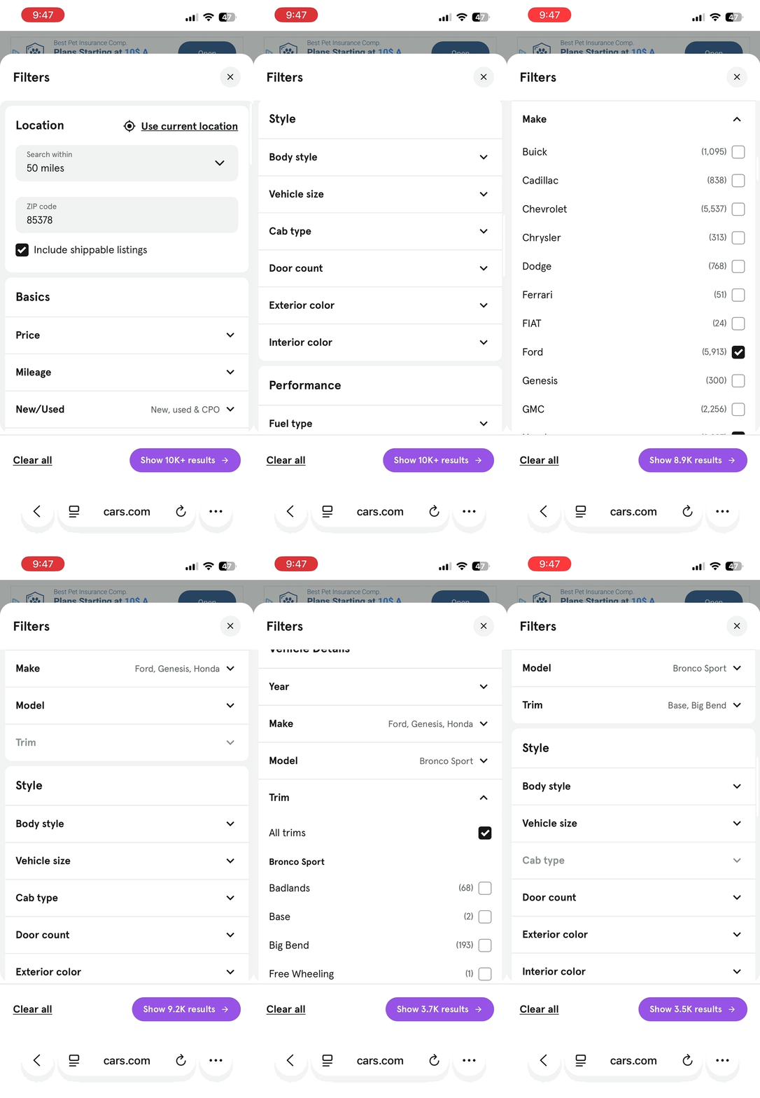
Clear groupings of related categories for easy access 👍
Avoids nested selections 👍
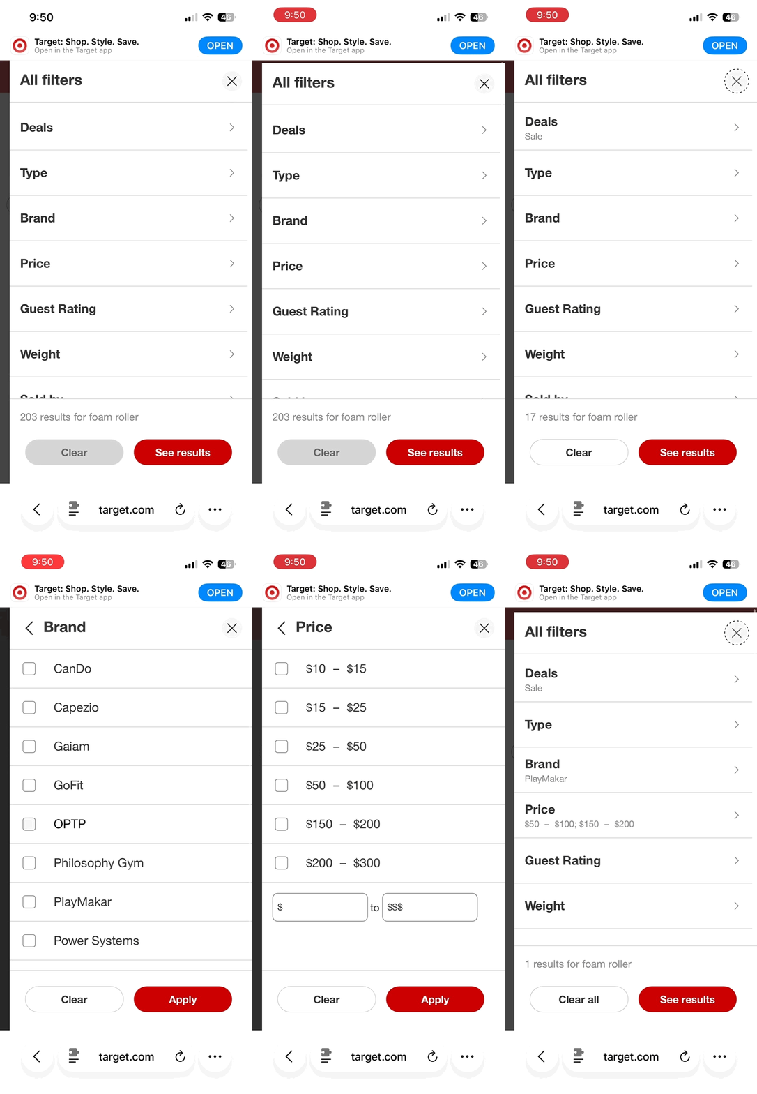
Target
Contextual summaries improve visibility of selections 👍
Unclear category names 👎
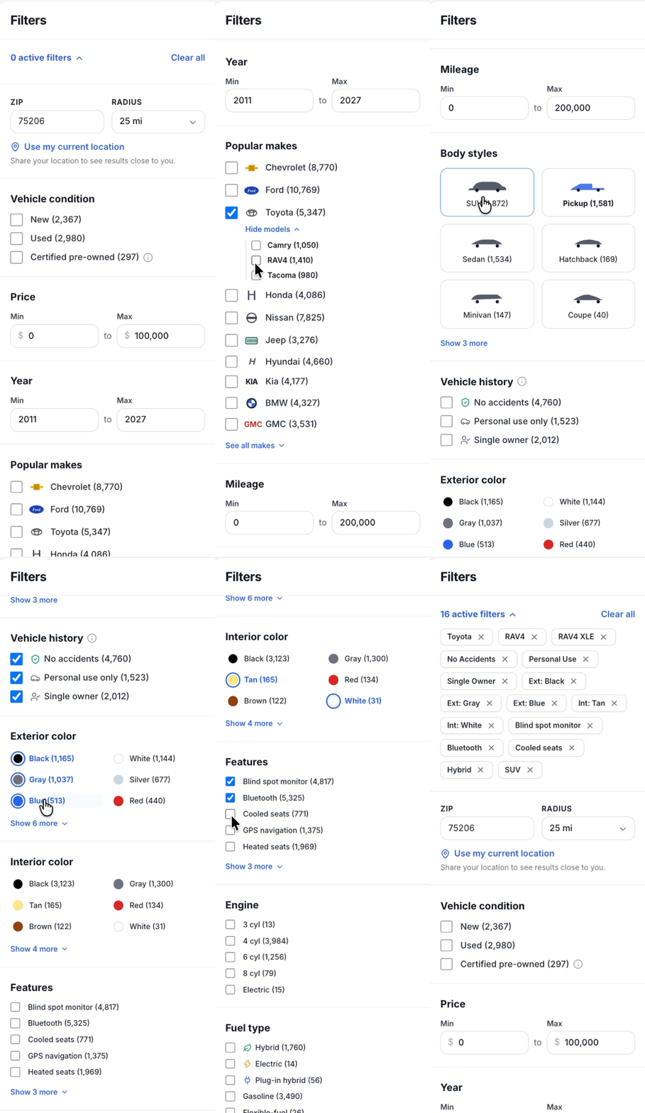
Auto Navigator
Deeply nested interactions 👎
Unnecessary “show more'“ cta’s 👎
Extensive scrolling 👎
These insights shaped the design principles that guided the redesign.
Reduce unnecessary scrolling by helping users navigate directly to relevant filter categories.
Improve discoverability by surfacing the most frequently used filters and reducing hidden interactions.
Lower cognitive load through clearer information hierarchy.
Keep users oriented by providing cleaner, contextual feedback on applied filters.
Solution
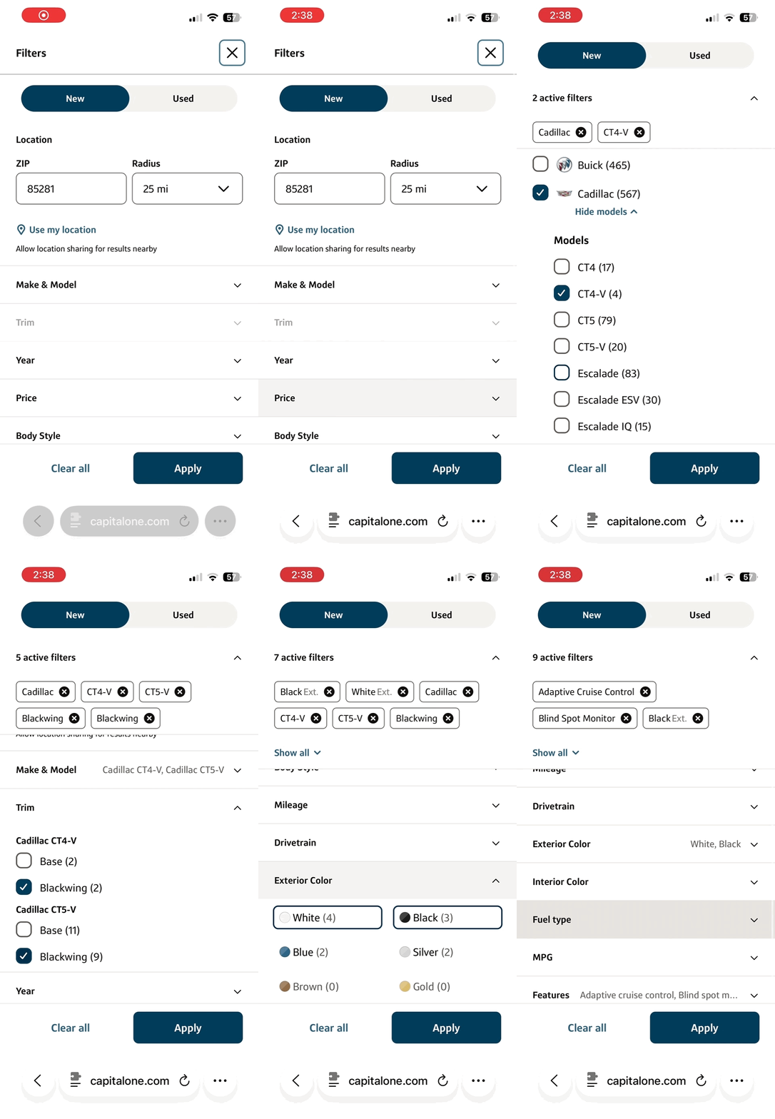
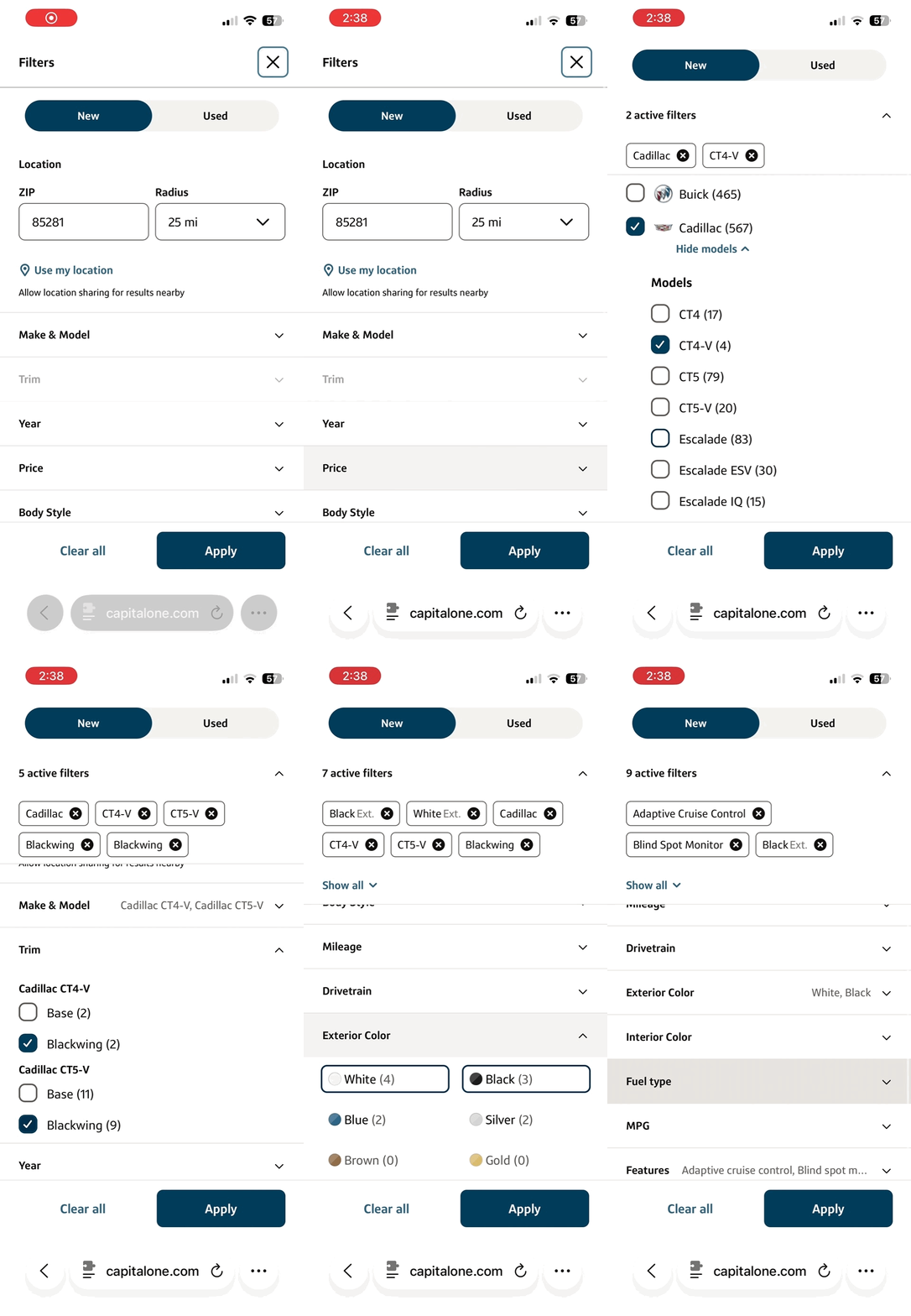
Implemented accordion style categorization → improve discoverability + reduce scrolling + lower cognitive load
Reordered filter categories based on usage → improve discoverability
Separated Make/Model and Trim → improve discoverability + lower cognitive load
Added contextual filter summaries → Keep users oriented, while reducing the need for a dedicated active filter section that takes up prime real estate.
Results & Key Learnings
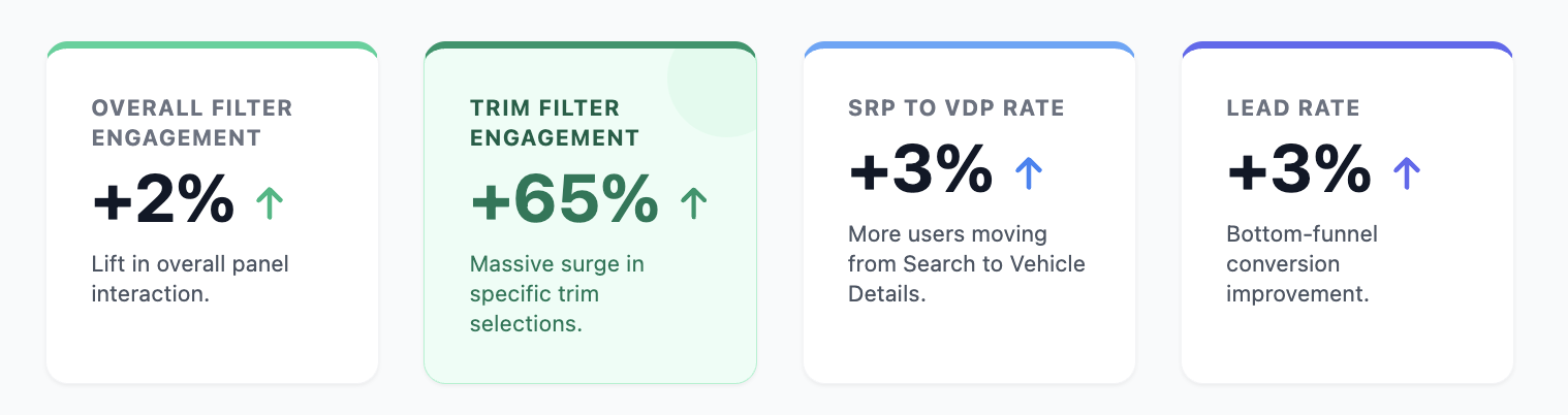
Although overall filter engagement increased by just 2%, the redesign fundamentally changed how shoppers interacted with the experience. Making high-value filters easier to discover led to a 65% increase in Trim usage, helping shoppers refine their searches more effectively. This improvement carried through the funnel, increasing progression to Vehicle Detail Pages (+3%) and lead submissions (+3%).
Key Takeaway: Small improvements to discoverability at a critical decision point can meaningfully influence downstream shopping behavior.
My Contribution:
✓ Conducted competitive research and user testing to identify friction and validate design decisions.
✓ Prioritized enhancements based on user impact, business value, and technical feasibility.
✓ Partnered closely with design to iterate on UI patterns, interactions, and information architecture.
✓ Led product execution with engineering, resolving blockers and guiding implementation decisions.
✓ Defined the monitoring plan with Business Analytics for a 50/50 A/B Optimizely test to evaluate replacing the existing filter panel.