Homepage Carousel Experiment on Auto Navigator
Project Overview
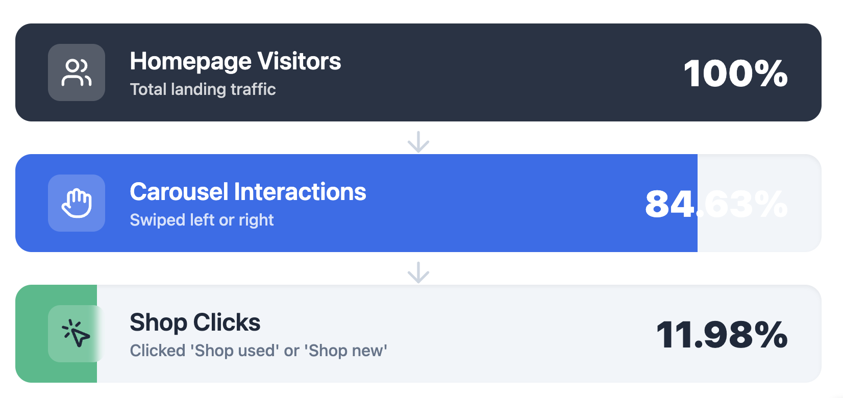
I led an initiative to redesign Auto Navigator's homepage shopping entry point after discovering that, despite occupying premium homepage real estate, only 12% of users clicked through it. Partnering with design, analytics, and engineering, I explored six design concepts and launched four A/B test variants to improve vehicle discovery for both first-time and returning shoppers.
Role
Product Manager
Timeline
6 weeks
Team
PM • Product Designer • Analytics • Engineering
Problem Statement
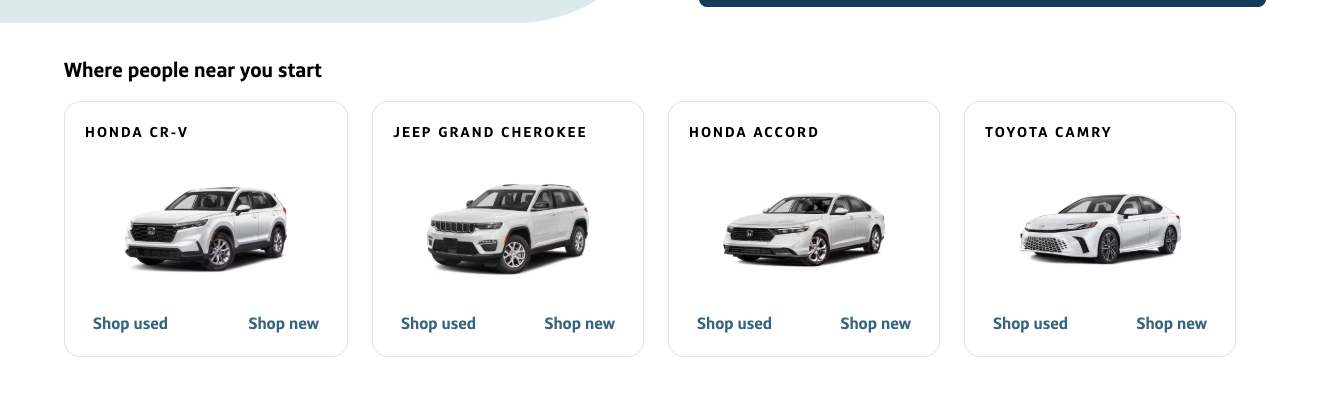
Auto Navigator's homepage serves as a critical entry point into shopping, but users arrive with very different needs and levels of intent. Some are exploring broadly, while others are returning with specific vehicles or criteria already in mind. The existing experience (as seen below) wasn't effectively supporting these different shopping behaviors, creating an opportunity to better guide users into the shopping journey while driving stronger downstream engagement.
Solution
The design team and I worked through several design directions focused on the following 3 pillars:
1. Make recommendations feel more relevant
2. Support different shopping mental models
3. Personalize the experience using available customer signals
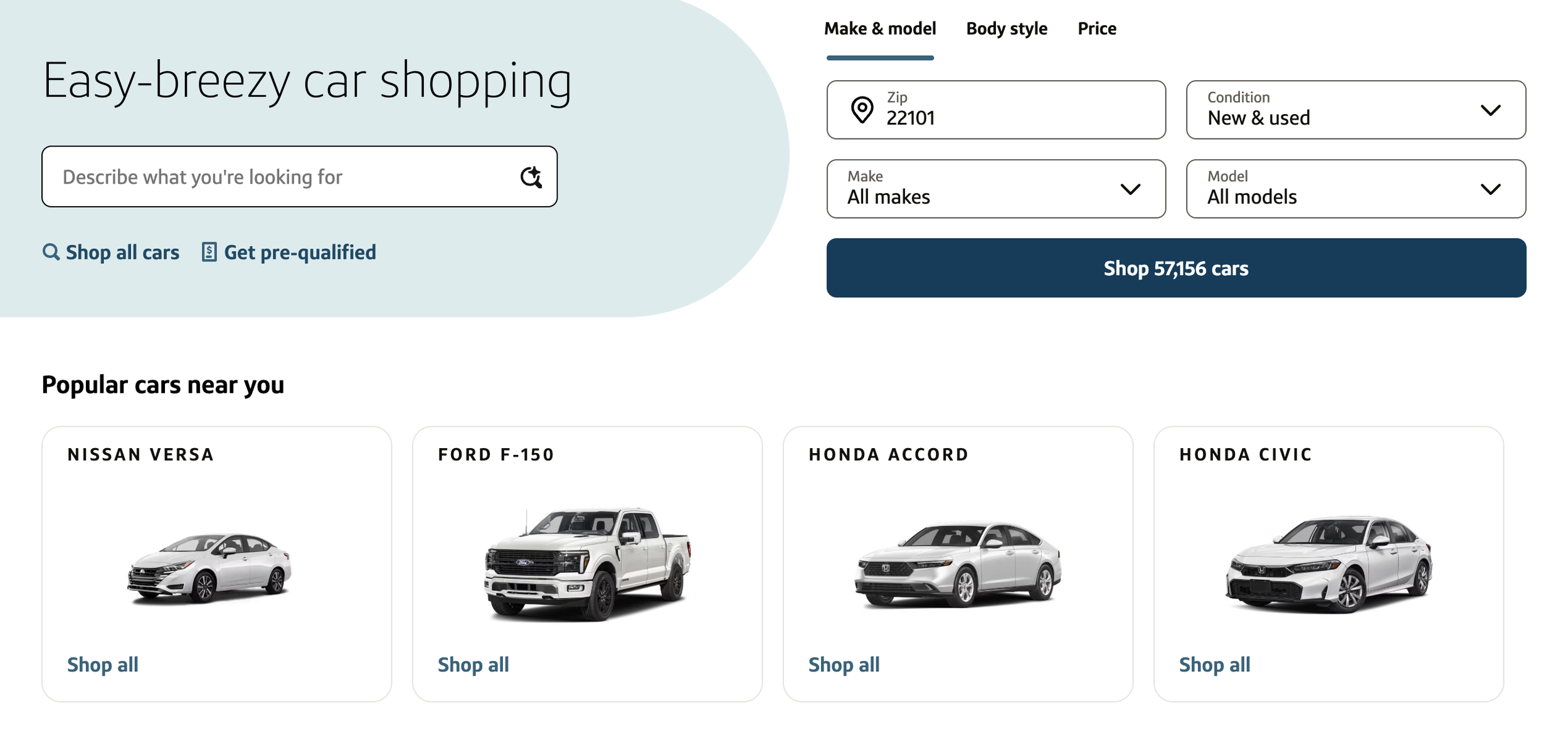
Variant 1: Popular Cars Near You
Designed For:
Users who are early in their shopping journey and looking for inspiration on where to start.
Key Design Decisions:
Simplified the original experience down to a single CTA to reduce decision fatigue.
Simplified the header to make the carousel's purpose more obvious and reduce the cognitive effort required to interpret the content.
Kept vehicle imagery since seeing actual cars can help spark inspiration.
Hypothesis:
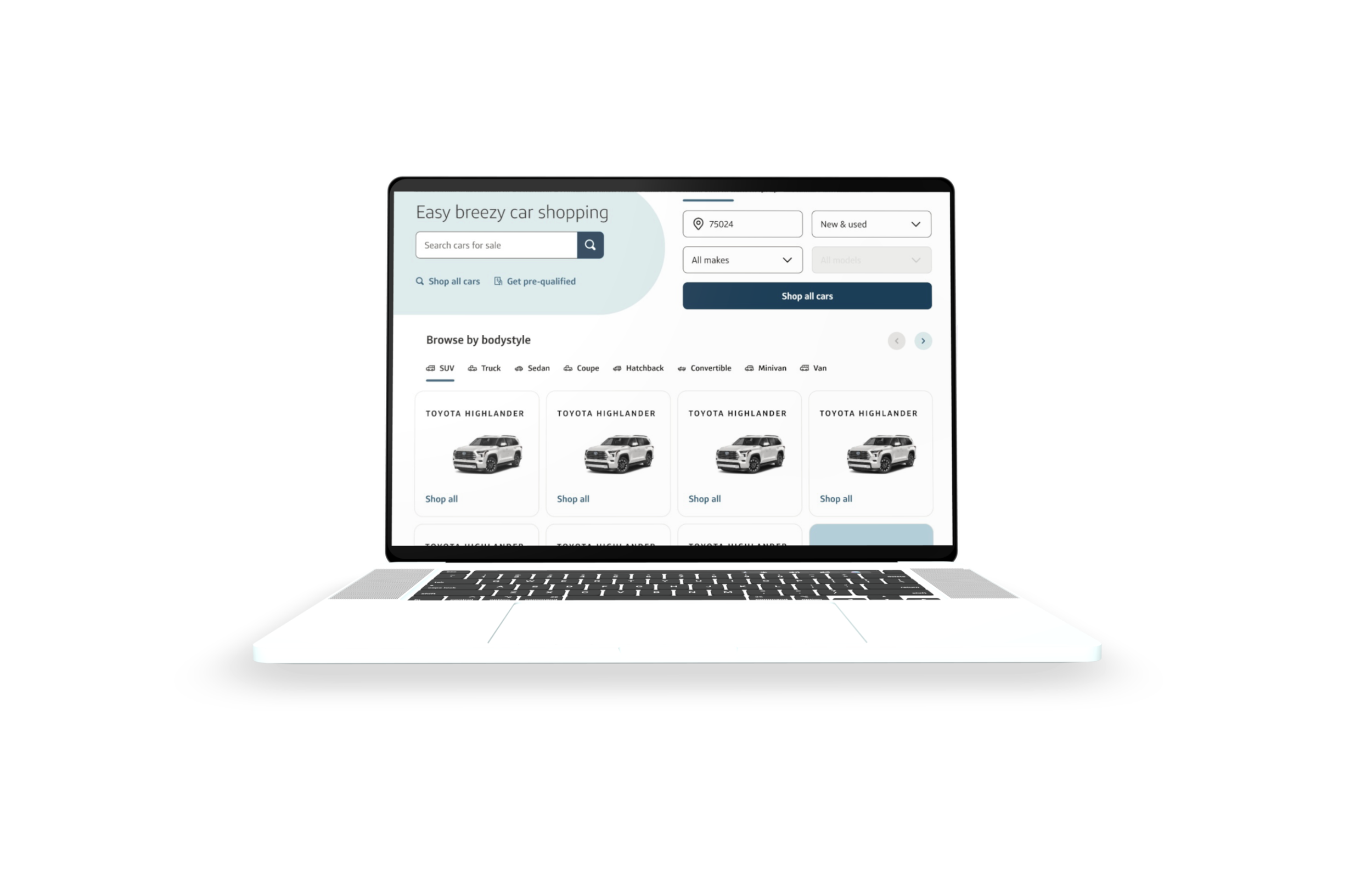
Showing vehicles that are popular nearby may provide exploratory shoppers with an easier and more confidence-building starting point.
Variant 2: Browse By Body Style
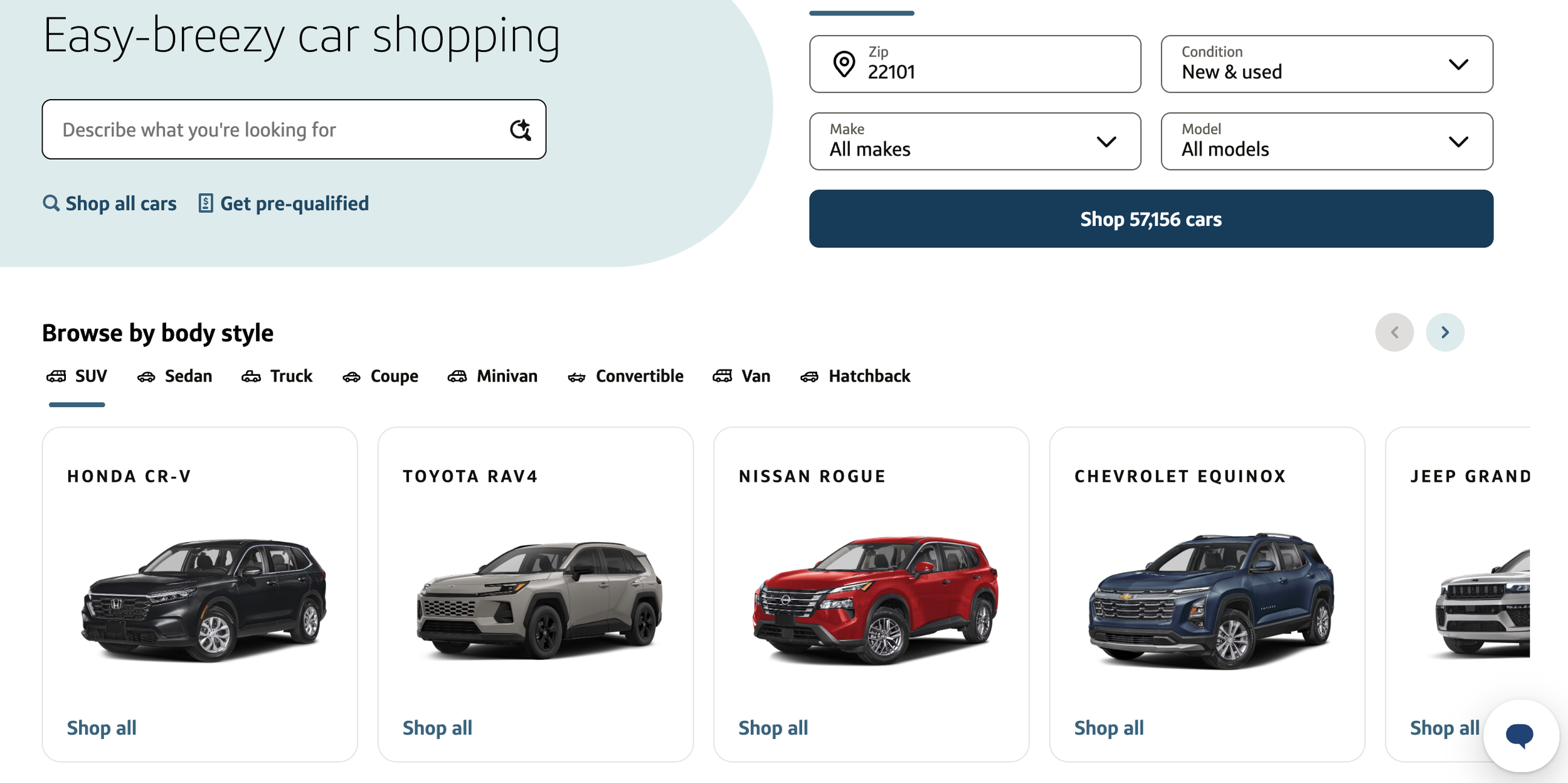
Designed For:
Users who know the type of vehicle they want (SUV, truck, sedan, etc.) but haven't narrowed down a specific make or model.
Key Design Decisions:
Introduced body style tabs to support category-based exploration.
Used new vehicle colors to create a more visually engaging experience.
Allowed users to self-select into a shopping path that best matched their needs.
Hypothesis:
Starting with broad categories may feel more intuitive for users who have lifestyle preferences but aren't ready to choose a specific vehicle.
Variant 3: Recent Searches
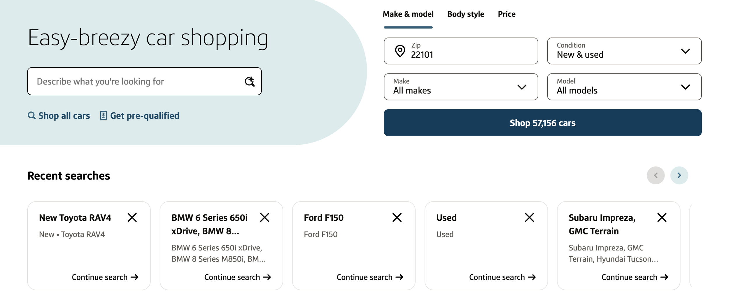
Designed For:
Returning shoppers who want to quickly pick up where they left off.
Key Design Decisions:
I leveraged a proven pattern from our native app to create a more consistent cross-platform experience.
Removed imagery after lightweight testing suggested it created unnecessary noise.
Surfaced previously applied filters directly on each card to improve recognition.
Hypothesis:
Reducing the effort required to continue a previous search will increase downstream engagement.
Variant 4: Recently Viewed
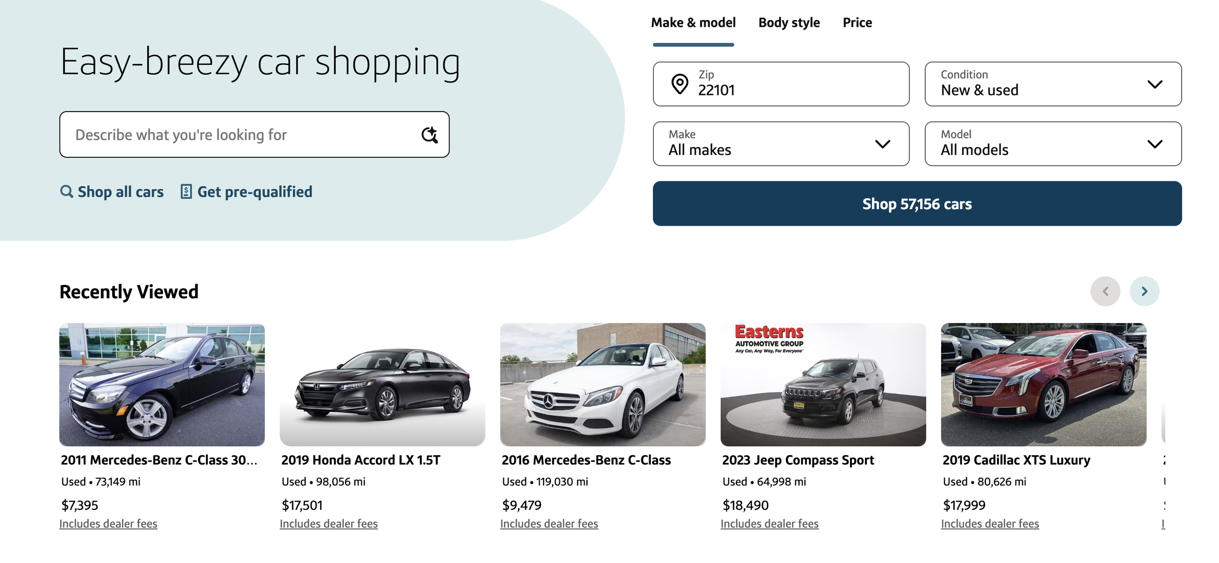
Designed For:
Higher-intent shoppers who have already engaged with specific vehicles.
Key Design Decisions:
Surfaced previously viewed inventory directly on the homepage.
Leaned into vehicle imagery since shoppers may recognize vehicles faster visually than through text alone.
Created a shorter path back into shopping for users with stronger purchase intent.
Hypothesis:
Making it easier to revisit previously viewed vehicles may encourage users to re-engage and continue progressing through the shopping journey.
Rollout Plan:
At the time of writing, all four variants have been launched in production and are currently being evaluated through an Optimizely A/B test. Success metrics include:
Direct Engagement: Carousel impressions, click-through rates, and interaction rates by variant
Discovery & Consideration: Increased traffic from the homepage to search results and vehicle detail pages
Shopping Behavior: Search bar usage, filter engagement, and downstream browsing activity following carousel interaction
Business Impact: Lead submission rates and overall funnel progression
Experience Quality: Bounce rates and alternative behaviors for users who didn't engage with recommendations
After 2 weeks, I plan to compare performance across variants to determine which experiences to scale, iterate on, or retire.
My Contribution:
✓ Partnered with Business Analytics to analyze six months of homepage engagement data and uncover opportunities to improve vehicle discovery.
✓ Collaborated with Product Design to identify different shopper mental models and explore multiple entry points into shopping.
✓ Leveraged AI-assisted prototyping to rapidly generate concepts and facilitate design discussions.
✓ Partnered with Data Science to better understand how our popularity logic worked today and identify opportunities to surface more relevant experiences.
✓ Worked closely with Engineering to define the technical execution strategy for each variant, including frontend changes, backend dependencies, Optimizely setup, and end-to-end QA testing.
✓ Defined the A/B testing strategy, success metrics, and rollout plan across four production variants.
✓ Drove alignment across Design, Engineering, Analytics, and Data Science throughout the experiment lifecycle.