GiveGood
Overview: GiveGood is a mobile social media application designed to connect people and nonprofits with the mission of increasing material donations to meaningful causes. By increasing sustainability, building trustworthy connections, and facilitating easier communication, GiveGood can change the world one donation at a time.
Role: Product Designer & Business Lead (3 months)
Tasks: Wire-framing, Prototyping, User Testing, Business Pitch Presentation, Competitor/Market Analysis
Background: As there were no designers on our school team, I took on the task of being both the business lead and the product designer. I aimed to balance between project management, constructing a business model, UI/UX design, wire-framing/prototyping, and conducting user interviews. This was a very rewarding experience, as this was when my initial interest within UI/UX design sparked.
Problem
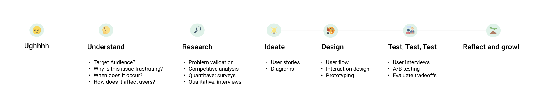
GiveGood is a passion project originally driven by a personal pain point of my mothers. Easily finding organizations/others to donate PHYSICAL materials to and/or donors was an apparent struggle as there were no running social media applications that let users connect for this sole goal. Below shows a brief overview of the process I took to tackle the issue.
Research
With this frustration in mind, I wanted to see if anyone else also faces the same problem. If so, I wanted to understand why it’s frustrating, when people feel frustrated, and how people currently deal with the frustration.
Research
Competitive Analysis
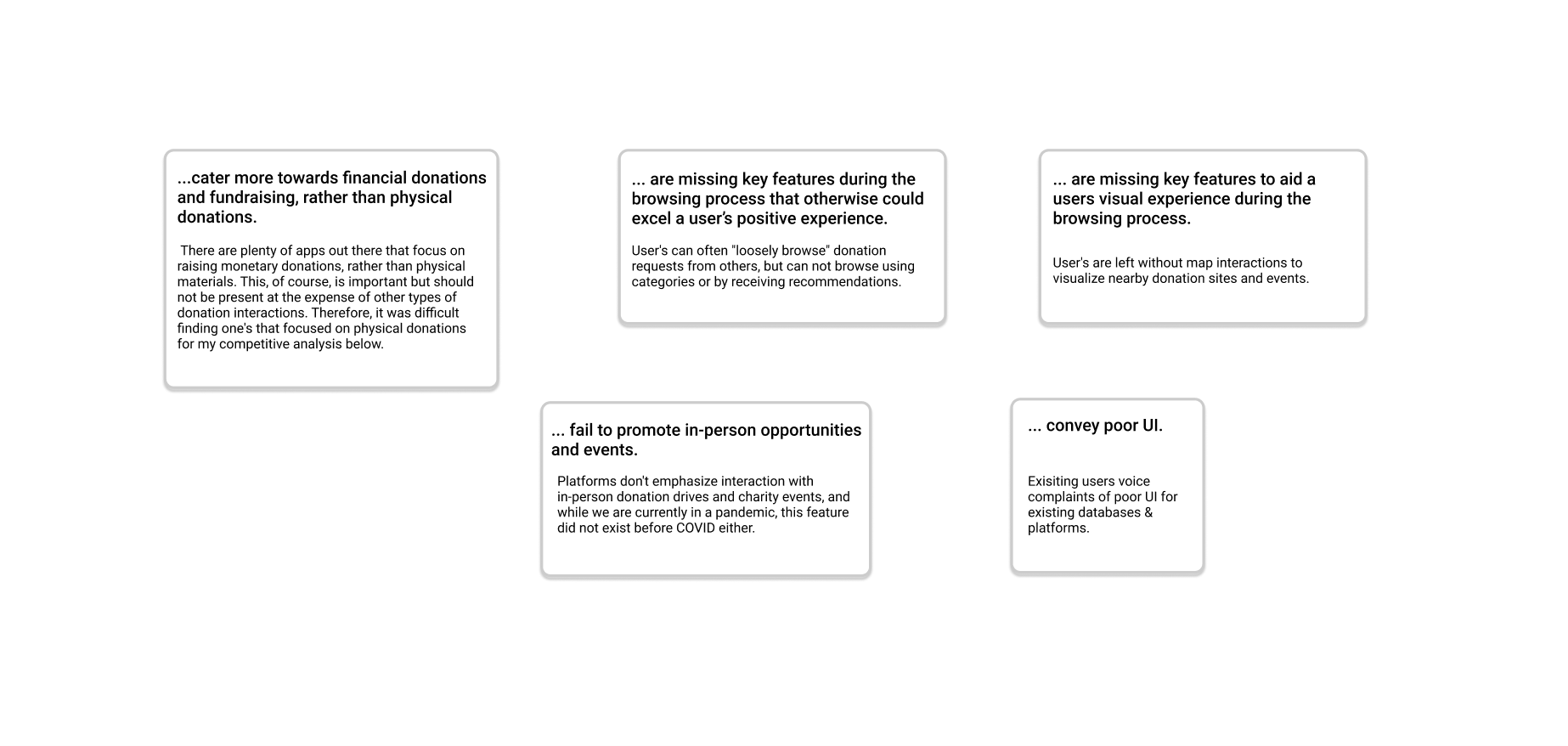
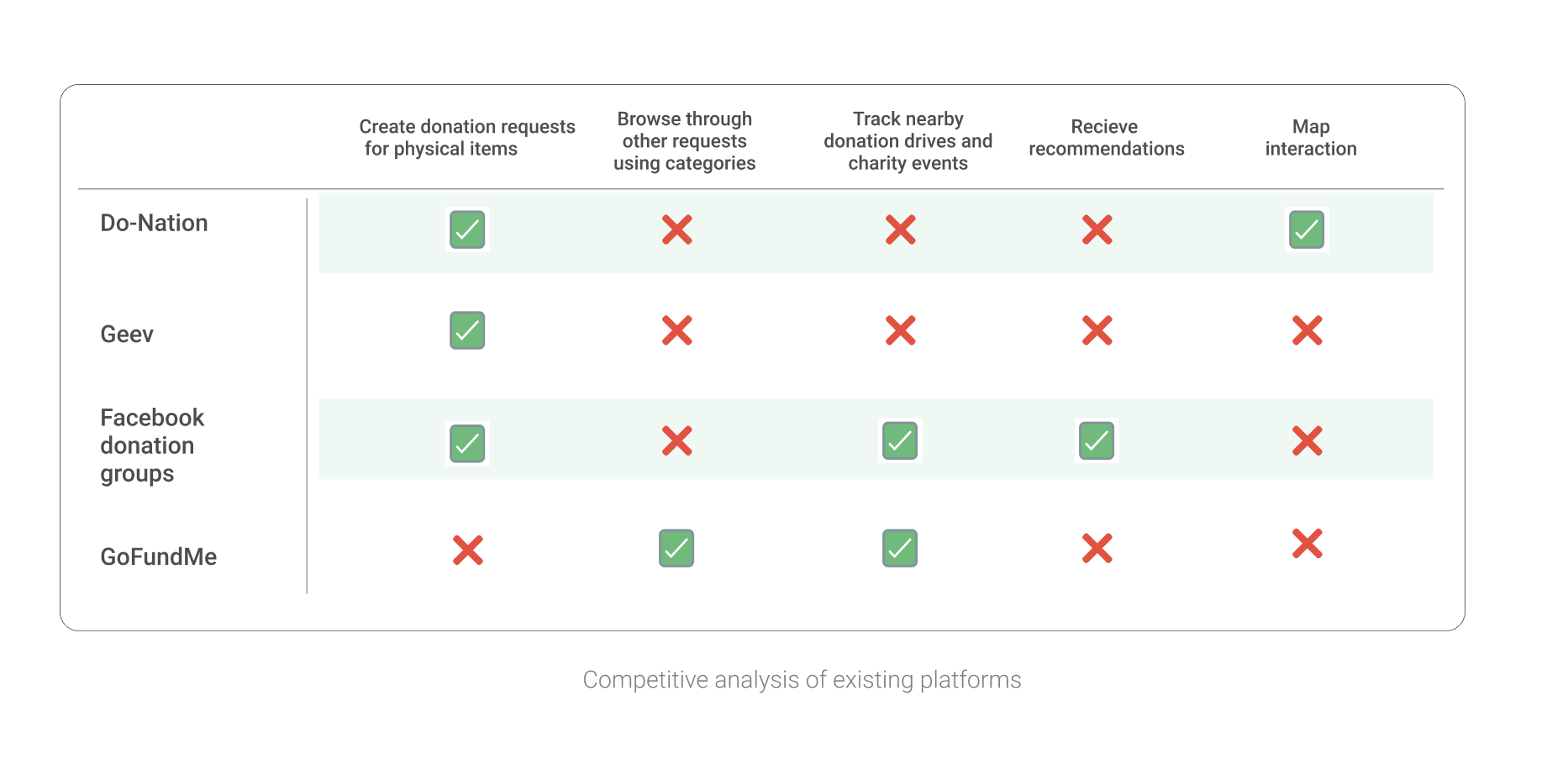
I began by doing some research to find what solutions and products are out there already. I identified them, picked out key features I desired GiveGood to have, and reevaluated the existing products based on those features. To my surprise, I found that there's not that many platforms out there specializing in PHYSICAL donations.
Key Takeaways
Current Apps….
Research
Surveys
As no proper solution exists, I began to wonder if this was an actual pain point shared by others as I did not want to fix something that wasn't actually broken. To see if the problem is significant for me to attempt a solution, I made a survey.
I sent out a survey to a group of 50 diversified individuals of different age groups, resident areas, and professions to gather quantitative data regarding the issue. We obtained 41 responses for our target user 1 (donors).
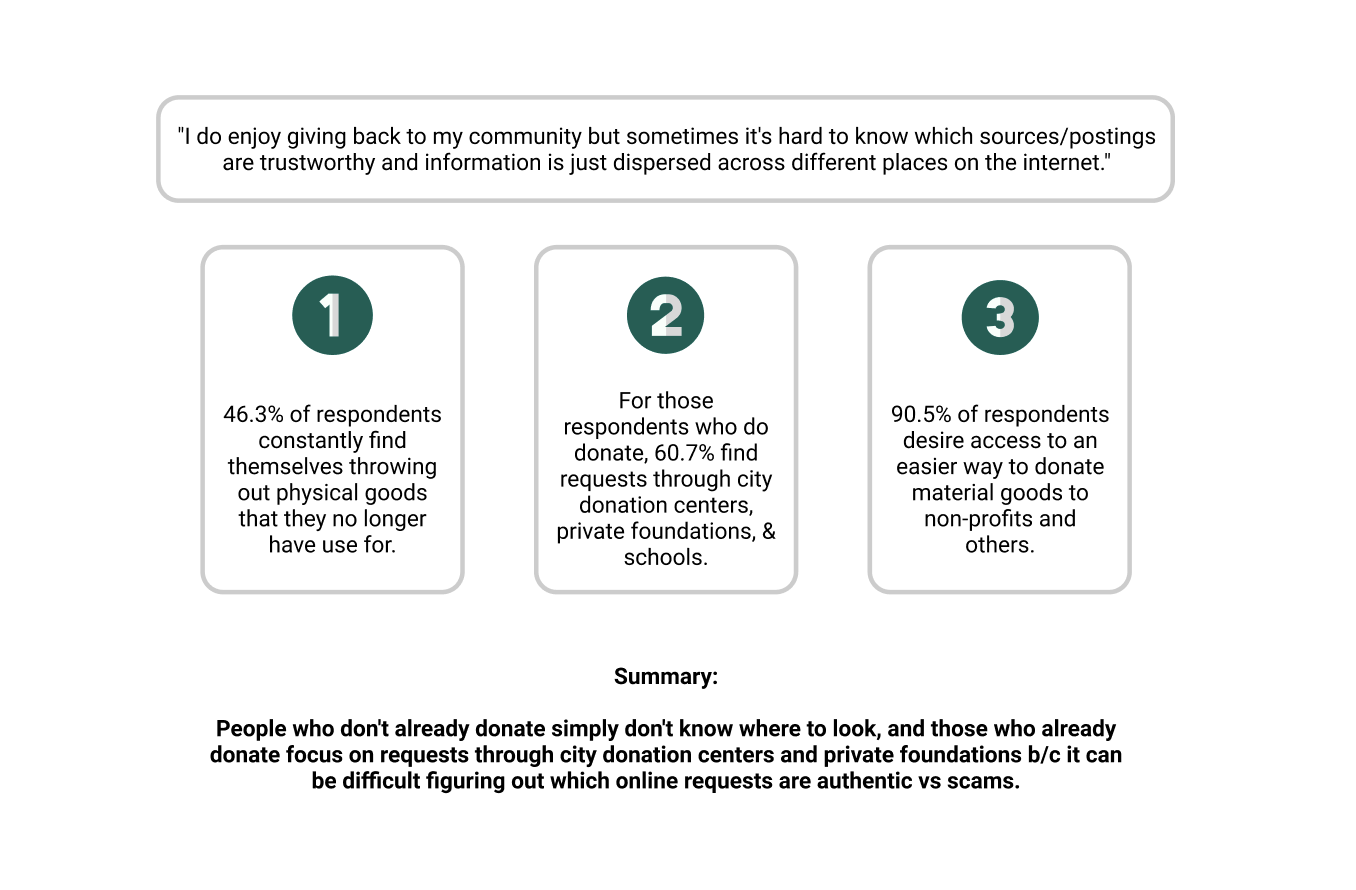
Research
Interviews
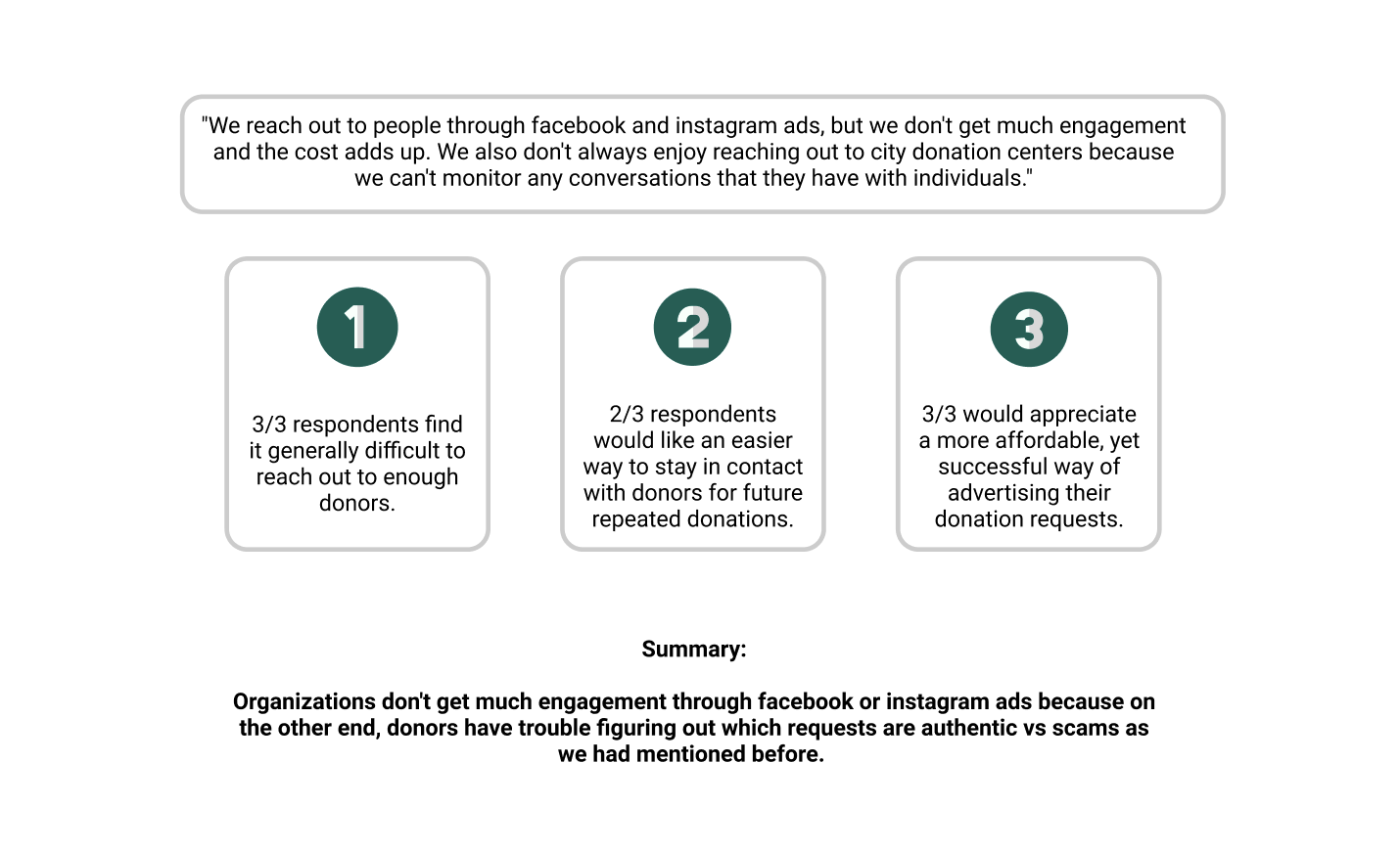
I sent out emails to organizations across the Austin, Texas area asking if donations made up a large part of their business and if so, would they be interested in a quick interview for a project. I then interviewed 3 with my time constraint to gather qualitative data regarding the issue from our target user 2 (organizations).
Ideation
Ideation
User stories
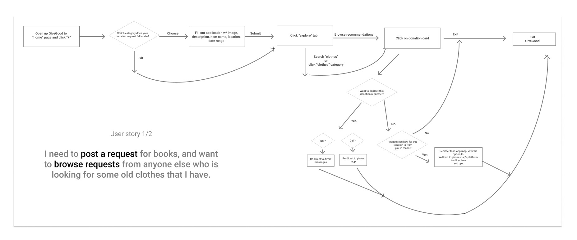
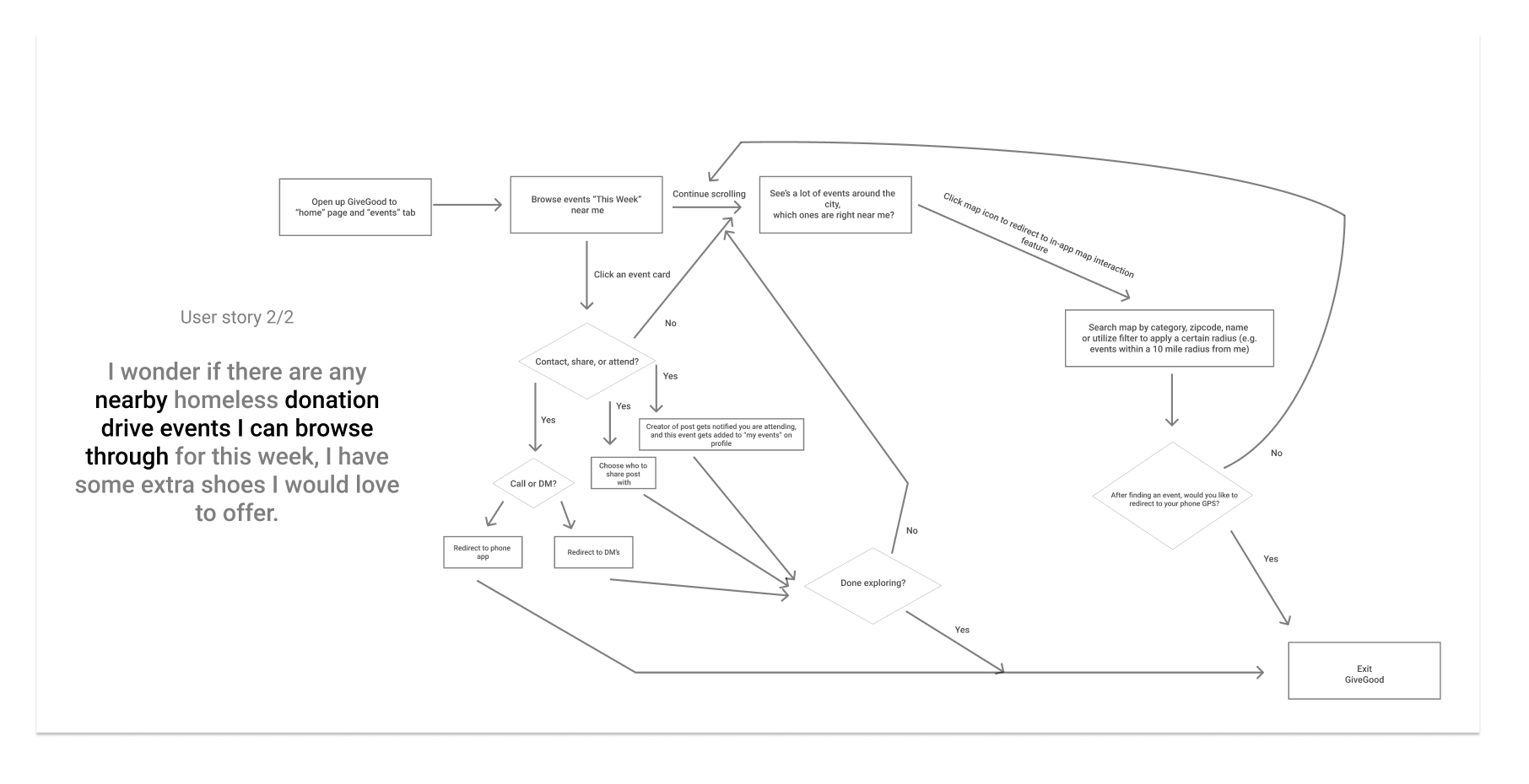
To better comprehend the scope of this project, I identified the three key features I wanted for GiveGood and then created user stories using the three features. I found that planning out task flows before designing allowed me to make more strategic design decisions by picking out opportunity vs failed areas.
This will also help me later during user testing when I ask users to perform specific tasks within GiveGood.
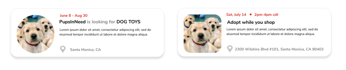
1. Creating & browsing requests with recommendations
2. Track nearby events
3. Map interaction
Design Decisions
Below is a brief look into my design decision discussions and thinking, I’d be happy to show a more detailed look into my decisions and reasoning!
Design Decisions
How might we make browsing donation requests & events effortless?
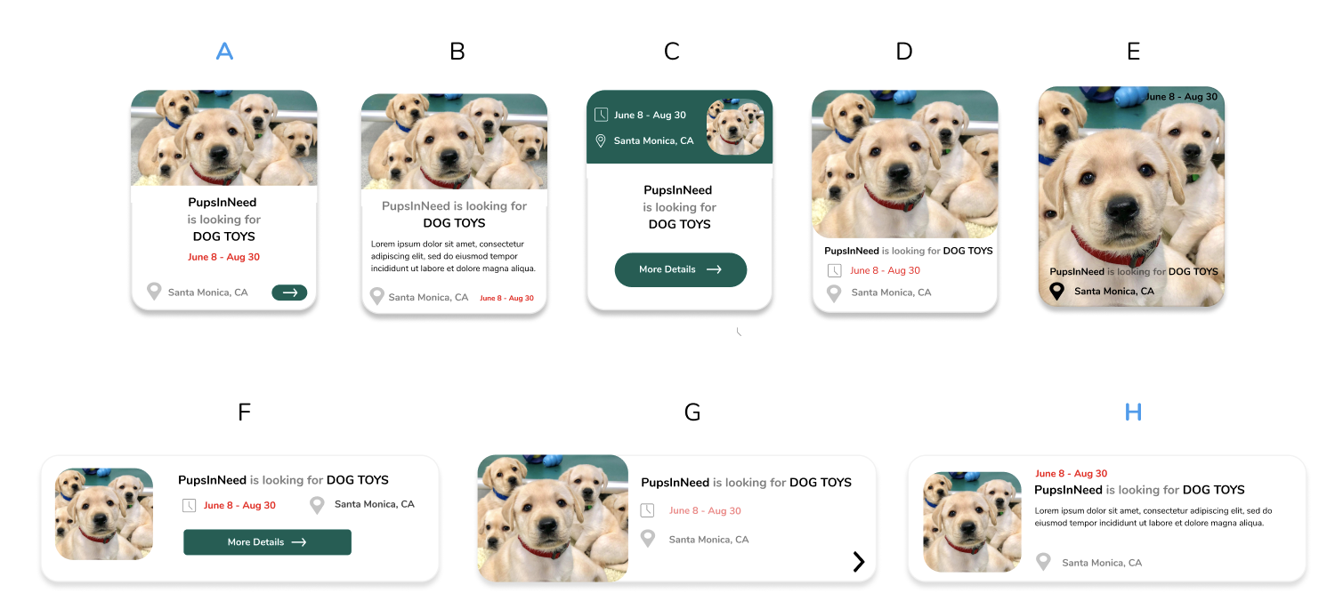
After eliminating iterations C,D,E for wrongly emphasized UI elements, B for overbearing information in a small space, and F,G for incorrect hierarchy of elements, I narrowed down to A and H.
I finally, chose Option H as it offered more incentivizing information when exploring compared to Option A.
Design Decisions
How might we make browsing donation requests & events EVEN MORE effortless?
Design Decisions goal #1
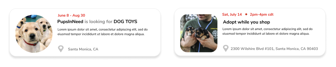
Differentiate between requests & events
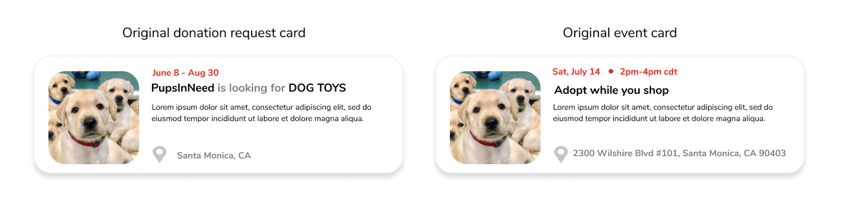
First Iteration:
After doing some research on differentiation among other apps, I noticed that music streaming services like Apple Music & Spotify use circle UI's for profile pictures, and square UI's for albums, songs, and events. Since this seemed like a familiar interface for users across more than one platform, I adopted it.
Second Iteration:
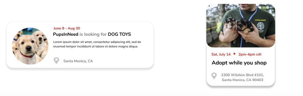
Encourage users to use different images when posting a donation request vs event.
Third Iteration:
Altered the the card shape for donation request vs event to allow the user to effortlessly tell the difference at just a glance.
Design Decisions goal #2
Search UI
“Explore” has much more real estate than “Search” so when someone searches for an event or donation request, ONE SIZE DOES NOT FIT ALL. We need to alter the UI of the card that pops up during the search dropdown.
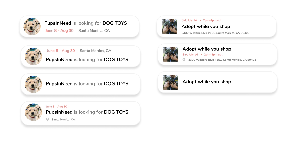
After iterating, I decided to not use a search dropdown feature because of inconsistent UI, multiple results in a small search dropdown can be overwhelming, and it makes much more sense for users to browse their search results in a bigger space with UI they are already familiar with.
Design Decisions goal and #3
Home and Explore Interfaces

I decided to go with this UI for my navigation bar
First, emphasize the “+” to create donation requests & events.
Second, emphasize the explore page bc users will spend most of their time here.
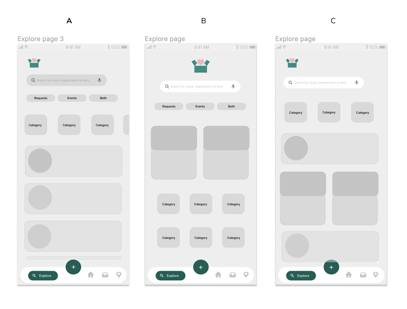
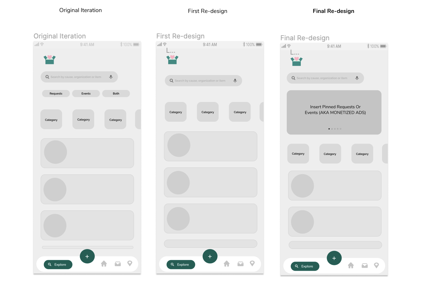
To drive engagement by keeping distractions at a minimum, I deciced to go with Option A. However, I wanted to make the user flow even more seamless and take out the filters at the top (requests, events, both). I wanted to emphasize the exploration of JUST donation requests on the explore page and move the events to another section of the interface.
Why just emphasize one type of post on the explore page?
Browsing donation requests are more important than browsing events as situations like COVID can halt features like events.
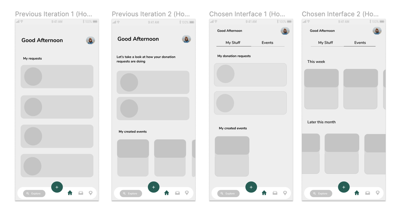
After previously deciding I wanted to keep donation requests and events on different parts of our interface, I had to eliminate previous iteration 1 of the home page since it left no area for events.
Previous iteration 2 - User enters the home page and can view all of their created donation requests, as well as their created events. The vertical scroll to horizontal scroll disruption is ok here because this is not a browsing oriented page. However, there is no set area here to look at other peoples events.
Chosen iteration 1/2 - Similar to previous iteration 2, but with the addition of an "Events" interface where users can horizontally browse other peoples events without being disrupted by the vertical scroll (when browsing donation requests).
Design Decisions goal #4
Map interactions
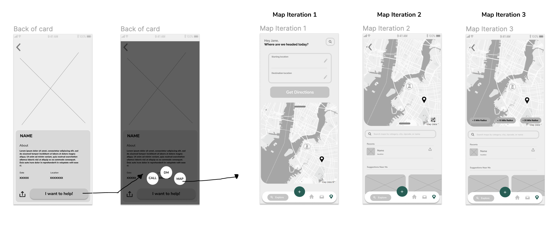
I decided to go with Option 3 because it offered a sense of familiarity for the user, and made all features very apparent.
Design Decisions
How might we help organizations optimize their brand while monetizing our app?

After discussing a business model with my team , we decided by adding "pinned" donation requests or events (aka monetized ads) at the top of the explore page similar to Tiktok's interface, we could monetize our app while helping organizations optimize their brand.
Design Decisions
How might we make finding and engaging with donors effortless for organizations?

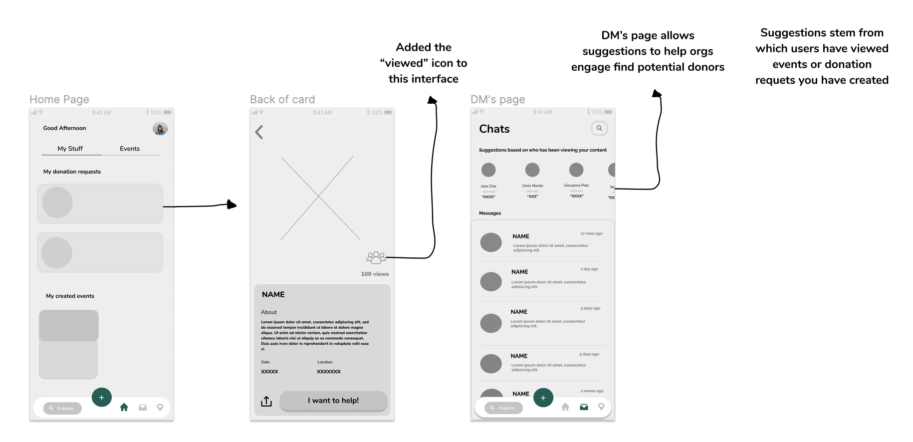
Because browsing/viewing posts is a primary action, I thought the users who have viewed one's donation request or event should be visible to the user who created them. However, after iterating I thought that there could be a more effortless interaction.
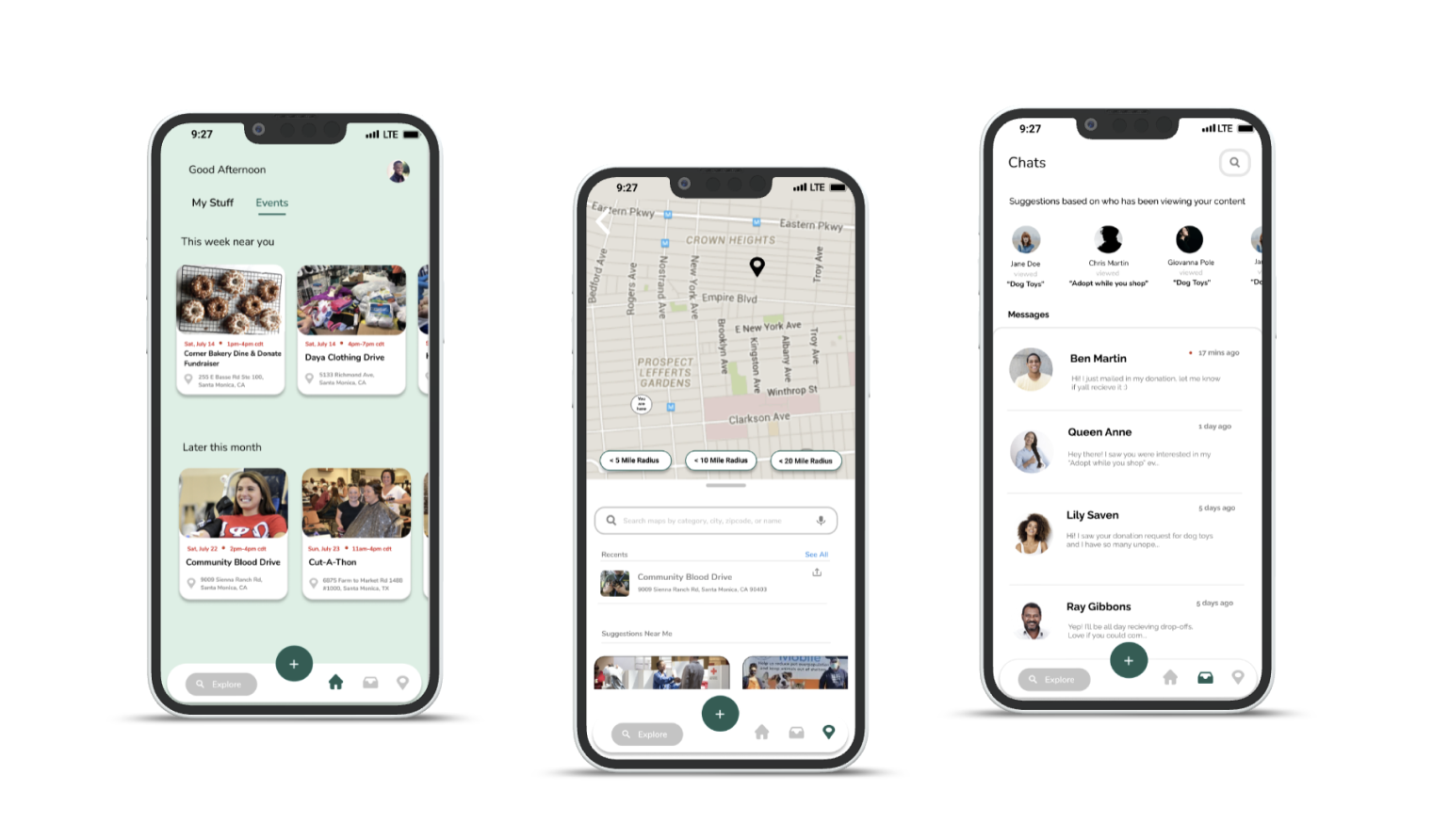
Instead, adding "suggestions based on who has viewed your content" in the DM's section can quicken an organization's process of finding potential donors. They then can foster engagement through communication in the DM's and create meaningful connections.
Wrapping up
Final Prototypes
Wrapping up
What I Learned
Don’t get attached to your work:
I definitely learned to not get too attached to my designs because more often than not, they are subject to change. Through my multiple iterations and advice from fellow designers, I had to reiterate, and reiterate before I came to a final prototype. Making sure to have a healthy detachment from my designs absolutely prevented me from my own design bias and getting overwhelmed.
However, I do think that I could have done some more explorations and testing throughout the process by involving more people. The more options I could allow myself to have, the better the end product.
Focus on the brainstorm process:
I believe I could have spent more time on the brainstorming process for this project and not have immediately jumped to making a stand-alone social media platform. Adding features to or altering already existing apps offers a better user onboarding and retention experience and wished I would have explored those options more.
Behavior vs Attitudes:
Asking users their opinions on certain concepts and experiences allow me to peer into their feelings and attitudes, but I was missing something key from my interviews - Behavior. I wish I had asked users to walkthrough their current flow of finding donations & donors and had them walk through competitors apps. This would have allowed me to actually see where in the flow they most struggle, where they were most content, and what I could base a solution off of.